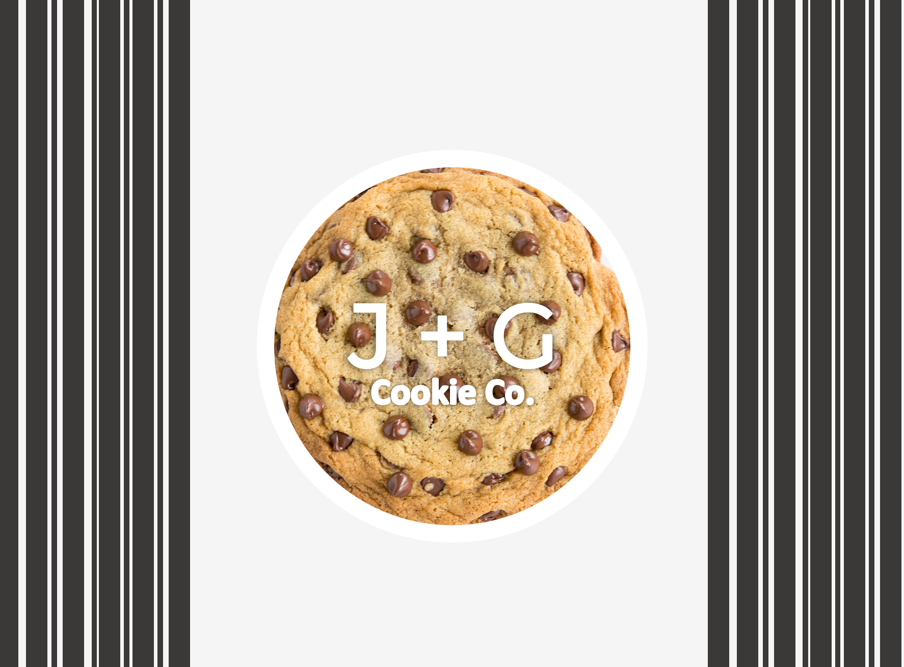
…was the theme shared with Kimberly at the start of this project. J & G Cookie Co. was founded by a grandmother and granddaughter team who loves to bake, and who’s family and friends have caused them to go into business from the weekly demand.
When starting the design process for this new start up, Kimberly thought a design aesthetic of classy and clean would make this company stand out in it’s industry, but reflected the personality of the owners as people who were serious about their craft, though the team included a 10-year old. Here, you’ll see early design concepts that was presented to the clients for review.
Clean and Elegant.
Adhering to her design style, Kimberly chose elegant and clean colors to incorporate into the logo and web design for J + G. This resulted in picking a muted mint, beautiful taupe, and light gray to pair with the dominate black and white logo design selected by the business owners.
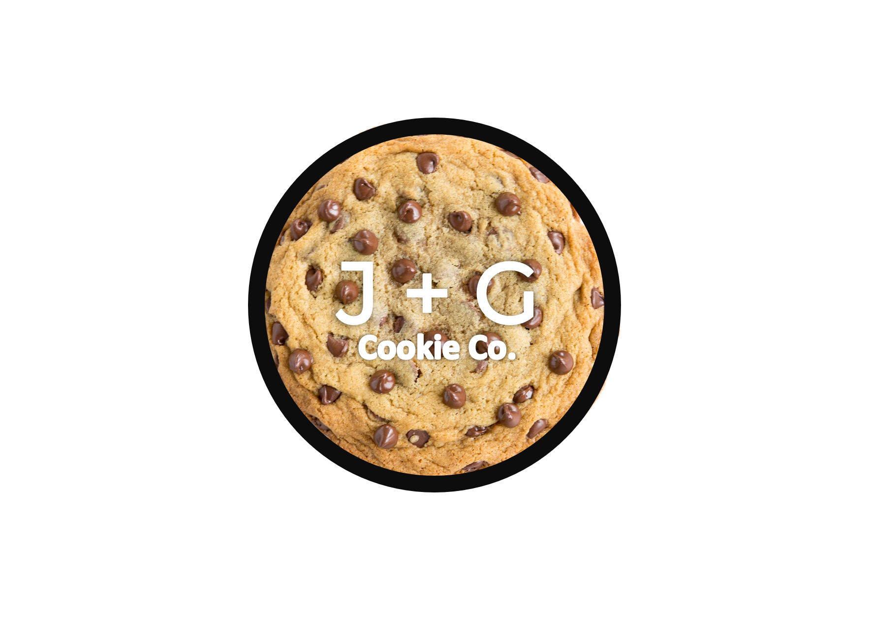
The Chosen One.
The clients inevitably chose the following logo for their company and were excited that their vision was finally coming to life.
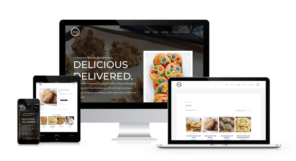
Now that the design elements were selected, and an initial consultation with the clients of what they may need on their website, Kimberly’s next step was to create a website for the clients to be able to showcase their products and make sales online.
Beauty + Function.
Kimberly prides herself on creating designs that are not only visually compelling but also highly functional. Every project is approached with intention—grounded in market research and thoughtfully planned before any web design begins.
She leverages UX best practices, competitive analysis, and prototyping to inform her process, translating insights into a clear and strategic design direction. This direction is presented to ensure alignment with the client before moving into development.
Once approved, Kimberly executes the build with confidence, delivering a final product that is not only cohesive and polished, but designed to perform and support the client’s goals.
The Final Design.
After the market analysis and planning phase, Kimberly created a sleek, easy to navigate e-commerce website for J+G Cookie Co. to showcase their delicious flavors and to begin making sales! (Kimberly being one of the first online buyers 🙂 )