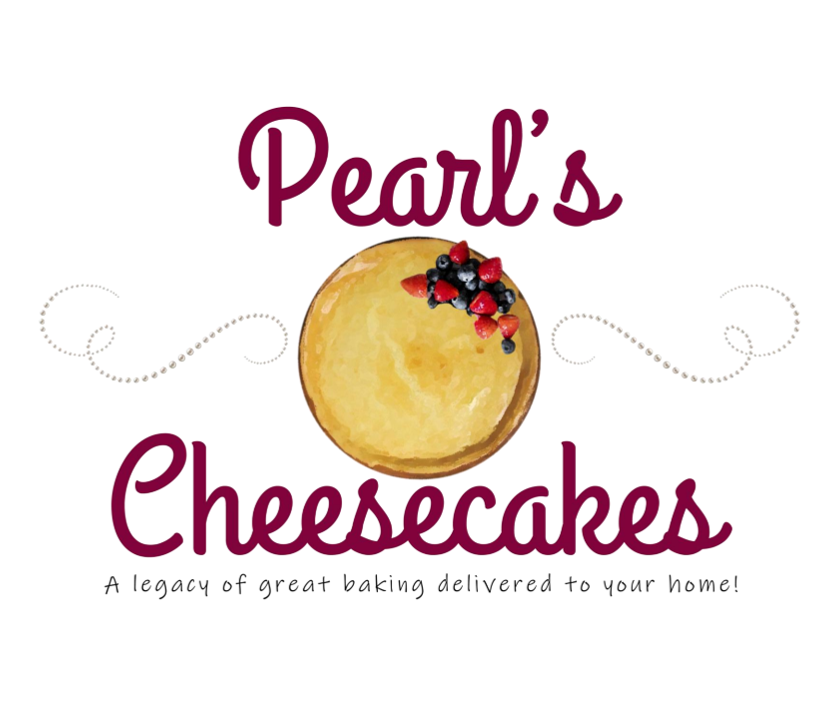
Commissioned by a 12 year-old entrepreneur, Kimberly set off to design for Pearl’s Cheesecakes using a design point of reference provided by the kidpreneur. Using this initial design concept as inspiration, Kimberly was able to create the following design options for consideration.
Kimberly wanted to convey the youthfulness found in the owner, while also providing a sense of professionalism and optimism.
Youthful and Smart.
Kimberly chose the following colors, with the approval of her client, to create a youthful but sharp design aesthetic. With a beautiful berry, pale pink, cheesecake gold, clean-linen white, and a light gray, Kimberly was able to establish a cohesive look for Pearl’s Cheesecakes that the client felt really captured her essence.
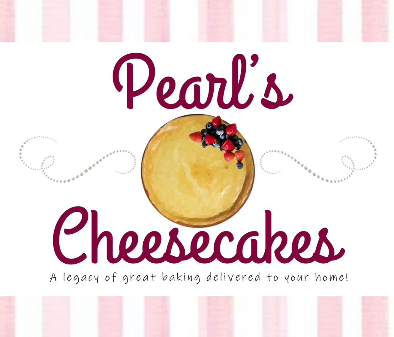
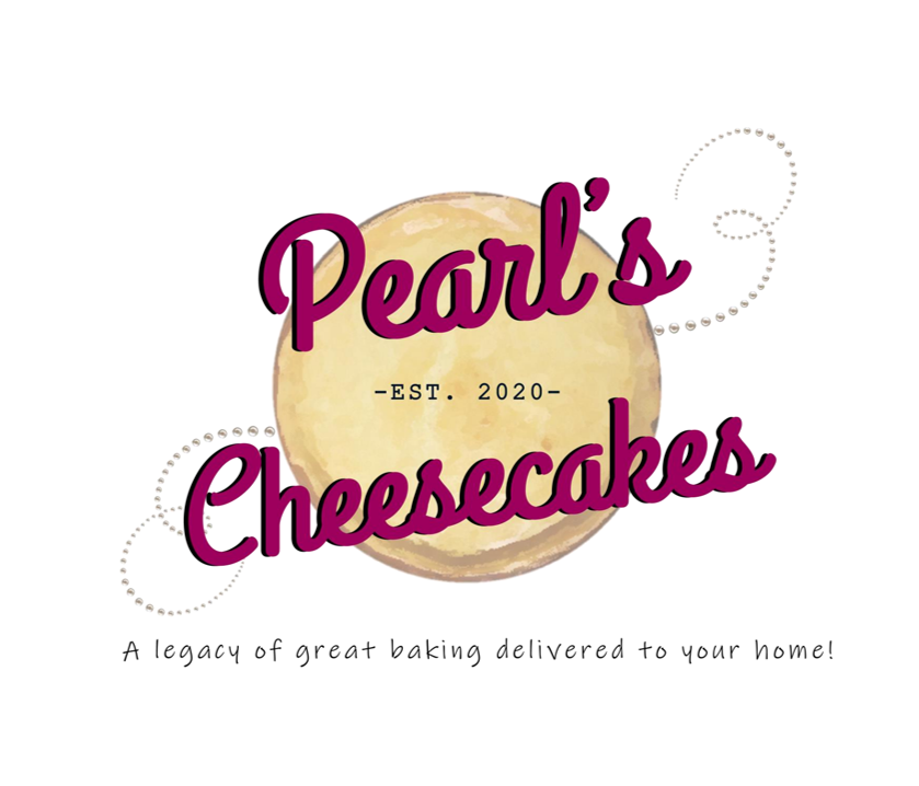
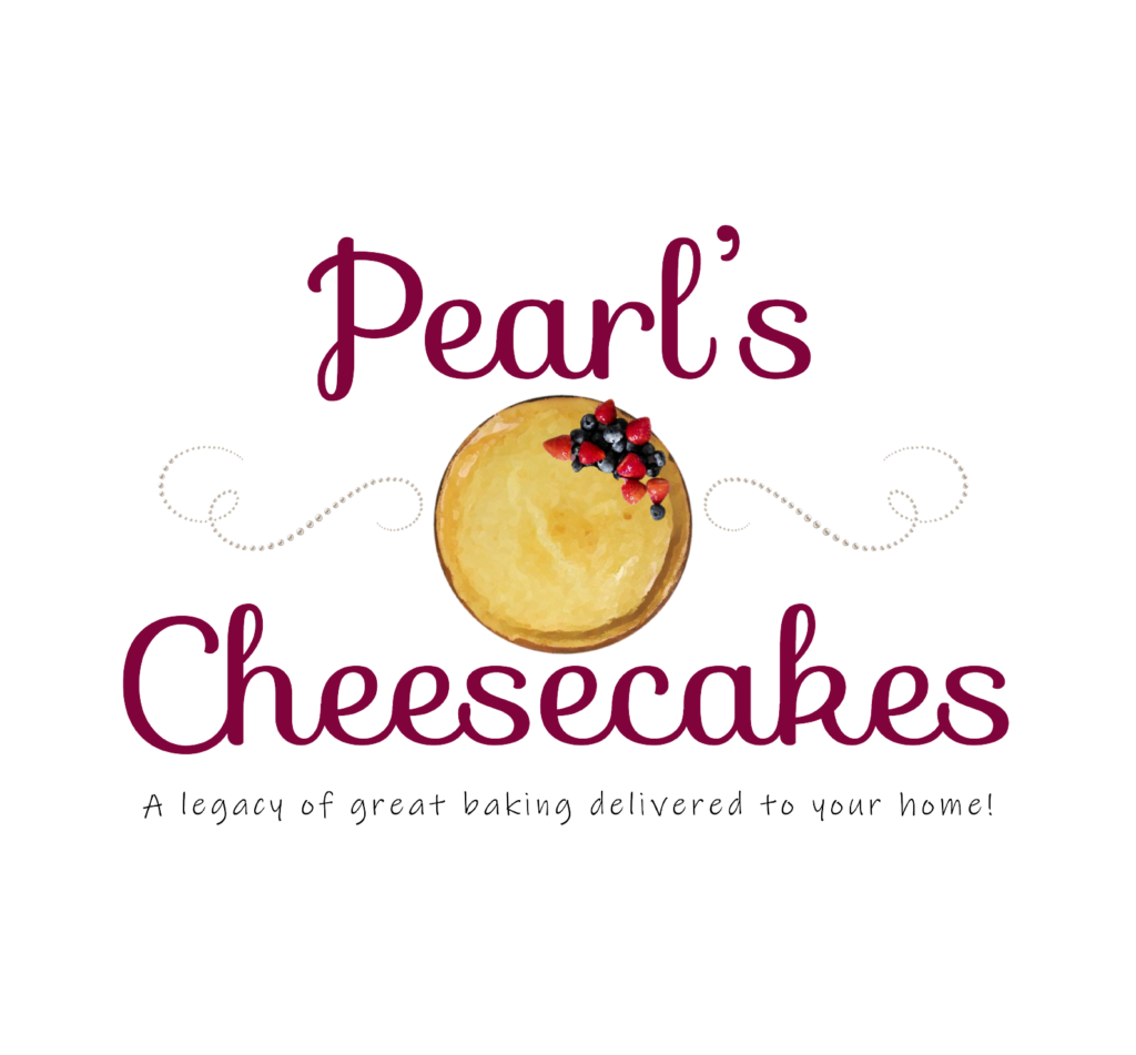
The One.
The client decided to go with the simple yet effective logo design presented here as the logo for her new company.
Using this newly designed logo, color scheme, and feedback from an initial client consultation, Kimberly went on to create marketing material and an e-commerce website for the client to be able to sell her delicacies online.
Beauty + Function.
For Pearl’s Cheesecakes, Kimberly conducted targeted market research on local and online competitors to identify key features expected in the dessert and bakery industry—while also uncovering opportunities to help the brand stand out.
Using these insights, she developed a strategic site map and a tailored design direction mockup that reflected both industry standards and Pearl’s unique personality. This was presented for client approval to ensure alignment before moving into the initial design phase.
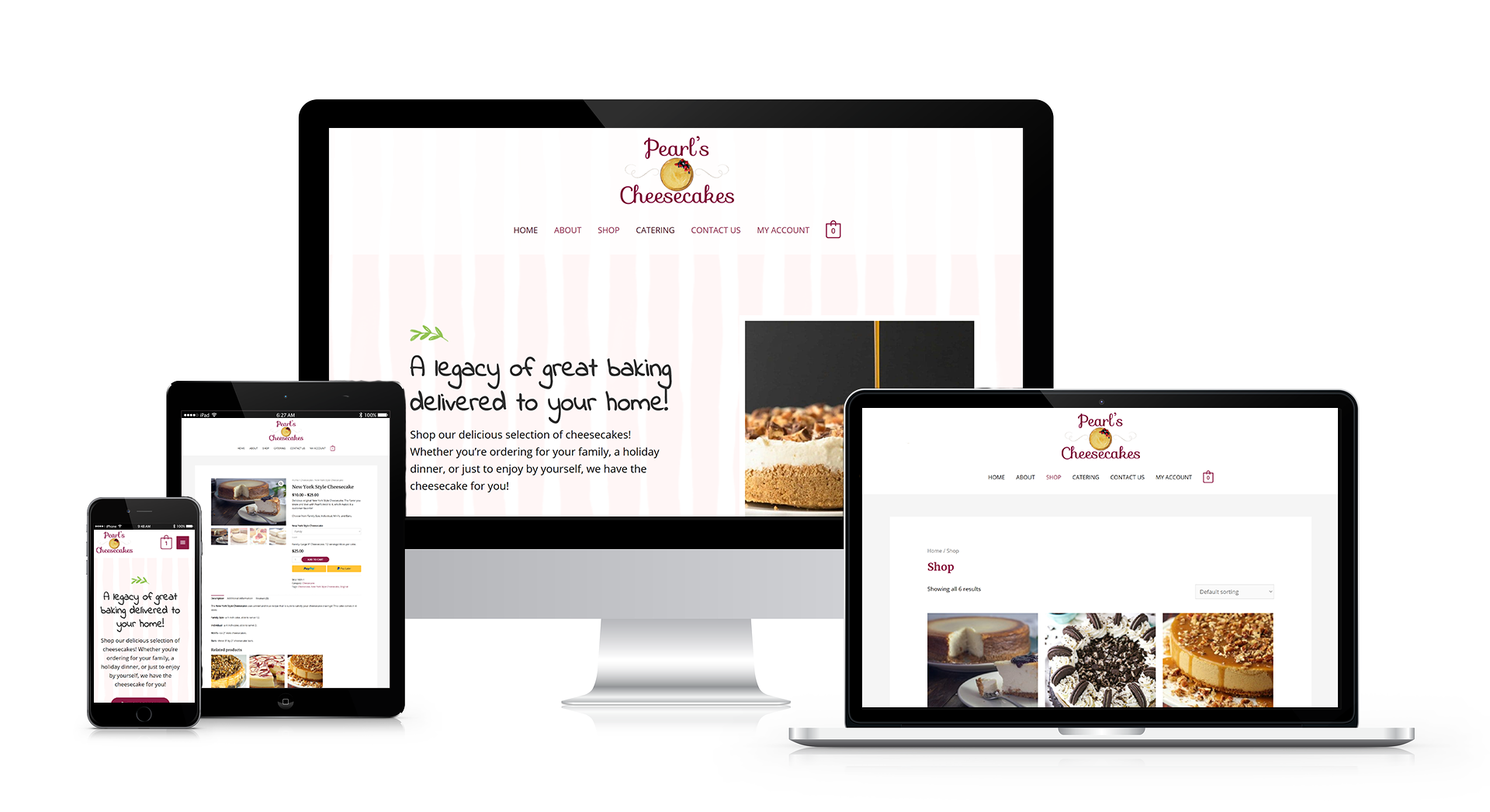
The Final Design.
In the end, Kimberly was able to create a beautifully cohesive 7-page ecommerce website for Pearl’s Cheesecakes. The client was very pleased with the results and was excited to begin selling her cheesecakes online to her friends and family!